Photo Registration Report Printout
Fix
- We improved the handling of certain photos in the photo registration printout.
New updates and improvements to Unrubble.
Due to a global Cloudflare outage this afternoon, some Unrubble system features may have experienced temporary accessibility issues.
Unfortunately, in this case there was no possible workaround on our side — we had to wait for Cloudflare’s response and fix.
Thank you for your patience, and we apologize for any inconvenience caused.
Update 18.11.2025, 14:42 UTC:
Cloudflare services have been restored, and all inEwi features are now operating normally.
You can monitor Cloudflare’s service status here: https://www.cloudflarestatus.com/
From unique teams of all shapes and sizes. We're committed on building tools that fit into any workflow, because everyone works differently.
Start unrubbling for free
Due to a Microsoft Azure outage at around UTC 15:50, some of our services may have been temporarily unavailable or not functioning correctly.
Please rest assured that we worked to restore full functionality as quickly as possible.
We sincerely apologize for any inconvenience this may have caused.
Update 29.10.2025, 17:32 UTC:
All Unrubble services are now operating normally.
You can monitor the status of the Microsoft Azure platform here: https://azure.status.microsoft/pl-pl/status
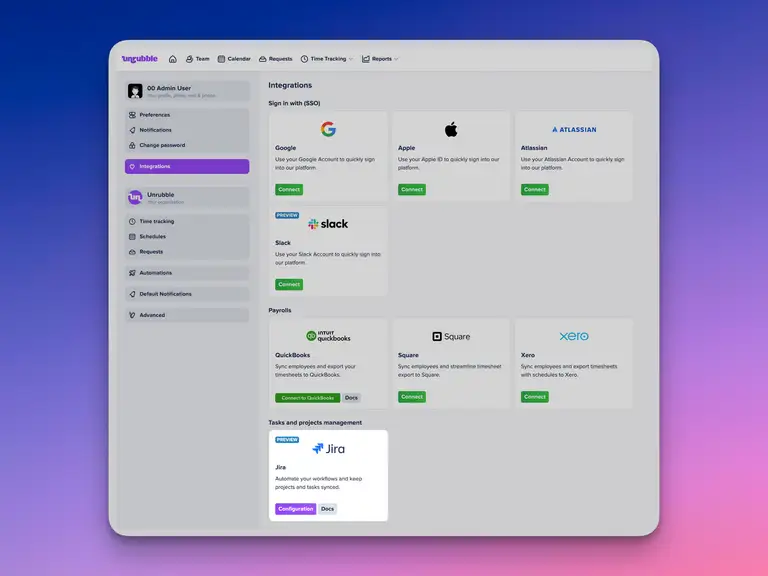
From now on, task-related work time appears in generated reports, summarized for each day.
You can find full details about this integration in this article: https://help.unrubble.com/en/article/jira-integration-15orovt/
You can also check information about the Tasks module, which is required to use the JIRA integration: https://help.unrubble.com/en/article/tasks-1w247u5/

The chat can be minimized, or you can even be on a completely different tab — the sound will always notify you of a new message.
Let Unrubble handle all your boring stuff.
Automate work schedule planning, work time tracking, pto management, and much more.
Start unrubbling for free
This website uses cookies, pixel tags, and local storage for performance, personalization, and marketing purposes. We use our own cookies and some from third parties. Only essential cookies are turned on by default.